|
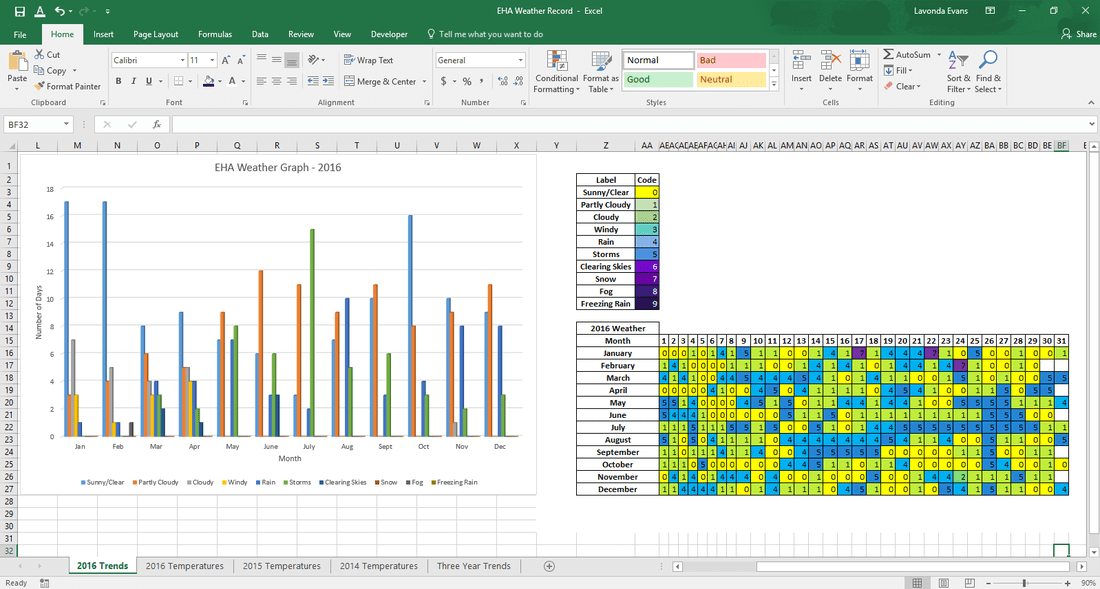
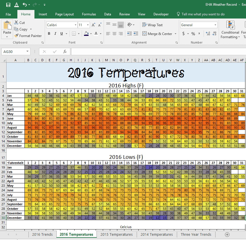
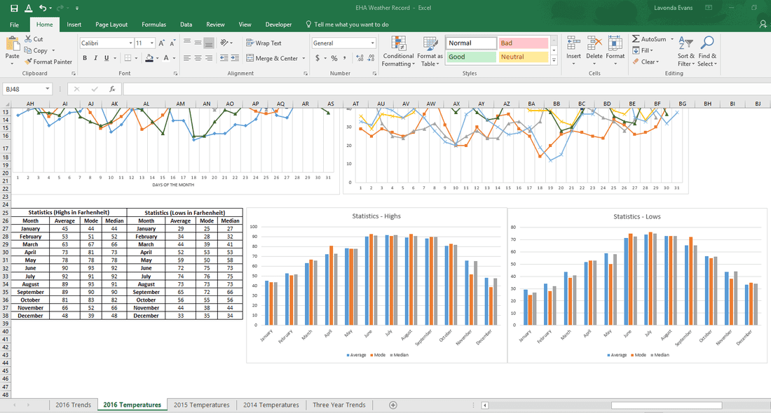
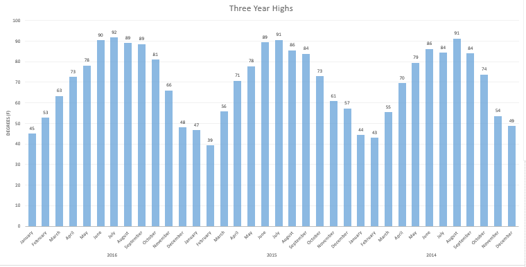
Hello lovely readers, I am excited to show what we've been working on at Evans Homeschool Academy! We all know that life is full of charts, graphs, cycles, and images. We also know that "reading" information can be one of the most mundane tasks we've ever had to fight through. But what if I told you that you can create some spectacular graphs, awesome data, and incorporate computer skills, mathematical terminology, equations, and conversions in one project?! Would you be surprised to know the data is as easy as checking the weather? For the last year, I've been working in my down time on a new project. The kids are learning more about graphs and data, averages, mode, median, and conversions for the next quarter of our schooling. I wanted some true life data that would be easily understood, but that would vary slightly, yet create a curve. Then I thought about weather. Temperatures change slightly over a short period of time, but are varied enough to create a bell curve over 12 months. The daily weather (rain, sunny, storms, etc.) also change and would allow us to graph that as well. But how was I to collect all of the data and how in the world would I store it? Then I thought about using excel to create spreadsheets. Then I figured, well, why not just teach the kids how to do it? So I did. And we came up with some pretty awesome graphs! Check these out! This graph shows the weather for our area. We coded the type to see it 'drawn out' on the right, for the whole year. We also used bar graphs for each month to display the variation of the types of weather we experienced. And here are some more! Here, we used a spreadsheet to chart the temperature for the highs and lows and used a formatting tool to color code them based on three different degree ranges. Of course, we had to incorporate talks of climate change and the environment. Mean, mode, and median are also important. We input formulas into excel to calculate these statistics and then created bar graphs to show the trends over the year. We also talked about Bell Curve and a few other statistical terms to "break the ice" on what they will be learning in the future. In this image, we used our data to create a three year histogram to visualize the temperature patterns and to see if there is a trend of "warming". We deduced that three years is not a suitable sample for determining any trends, but we came to the conclusion that summer temperatures seem to be occurring earlier in the year. On average in 2014, June was 86, in 2015, June was 89, and in 2016, June was 90.
We have thoroughly enjoyed using our weather as a way to learn about graphs, formulas, statistics, science, and math in general. Don't be afraid to get out there and scour up your weather patterns. You'd be surprised at how great those free and natural resources can be! Until next time, LaVonda
0 Comments
Leave a Reply. |
HELLOWelcome! My name is LaVonda. I am the wife of Rodney, the mom of 5 remarkable kids (well, 2 are adults now), an avid homeschooler, blogger, and sociologist. I am blessed with the ability to spend my time sharing our homeschool and life experiences with you. It is my hope to provide you with motivation, ideas, and some candid stress-relief through my blog - Mom's Scribe! Grab a cup of coffee, sit on down, and make yourself at home! Past Scribes
August 2020
Categories
All
|

 RSS Feed
